Backend Components - Detail
This tutorial is part of a series that covers the Shopware Backend Components. In the last tutorial we covered the Backend Components - Listing and the different configuration options of the Shopware.grid.Panel. In this tutorial, you'll learn the basics of the detail window and get a little example of it. This time, the Shopware.model.Container and Shopware.window.Detail components will be explained in more detail.
We will take the plugin result from the last tutorial as basis for this tutorial. If you don't have it already, you can download this plugin here: SwagProductListing.zip
The Shopware.window.Detail for the detail window was implemented in Resources/views/backend/swag_product_detail/view/detail/window.js.
The Shopware.model.Container for more detailed configuration of the detail window in Resources/views/backend/swag_product_detail/view/list/window.js.
Shopware.window.Detail Basics
The Shopware.window.Detail component, hereinafter referred to as detail window, is the entry to manage a record in detail and is defined as detailWindow in the Shopware.grid.Panel. The Shopware.grid.Panel calls the detail window with a single record. This is the only requirement for this component to work. The detail window will then create the view based on the Shopware.data.Model. That's why we create a relation in the configure() method right inside of the Shopware.data.Model.
Ext.define('Shopware.apps.SwagProductDetail.model.Product', {
    extend: 'Shopware.data.Model',
    configure: function() {
        return {
            controller: 'SwagProductDetail',
            detail: 'Shopware.apps.SwagProductDetail.view.detail.Product'
        };
    },
    fields: [
        { name : 'id', type: 'int', useNull: true },
        ...
    ]
});
Event Handling
The event handling of the Shopware.window.Detail and Shopware.model.Container components are managed by the Shopware.detail.Controller. This controller will be created and mapped by the Shopware.window.Detail automatically. To prevent duplicated event names, every event will be prefixed. The prefix will be determined by the class name of the given record.
Example:
The class name of the given record is Shopware.apps.SwagProductDetail.model.Product. The event prefix will then be product.
All events are now prefixed like this:
- product-save
- product-tab-changed
- ...
The Shopware.detail.Controller catches these events and performs the default actions for the appropriate event. In the Backend Component - Batch Processes you will learn how to deactivate or extend the Shopware default controller.
Shopware.model.Container Basics
In this section of the tutorial, we'll focus on the Shopware.model.Container, hereinafter referred to as model container, and how it works behind the scenes. In addition, you'll learn how the model container creates the field sets, the input fields and how to configure them properly. The requirements are that the property record should contain a Shopware.data.Model instance and that the controller property should be the name of the PHP controller.
Generating forms
The base for the form generation is the Shopware.data.Model instance provided in the record property. By default, you have to create every field manually except for the id property. This should result in a faster application. Furthermore, only one field set will be created by default.
Ext.define('Shopware.apps.SwagProductDetail.model.Product', {
    extend: 'Shopware.data.Model',
    configure: { ... },
    fields: [
        { name : 'id', type: 'int', useNull: true },
        { name : 'name', type: 'string' },
        { name : 'active', type: 'boolean' },
        { name : 'createDate', type: 'date' },
        { name : 'description', type: 'string' },
        { name : 'descriptionLong', type: 'string' },
        { name : 'lastStock', type: 'boolean' }
    ]
});
Based on the field types, different default Shopware form fields will be created. Because a model can contain many more fields than those seen above, you can decide whether a field should be displayed alone or inside a field set. You can use the fieldSets configuration option to group them according to your needs. The fieldSets parameter is an array of objects, each containing a title and fields. The title is the title of the field set whereas the property fields is an object of the desired fields defined as its keys.
Ext.define('Shopware.apps.SwagProductDetail.view.detail.Product', {
    extend: 'Shopware.model.Container',
    alias: 'widget.product-detail-container',
    configure: function() {
        return {
            controller: 'SwagProductDetail',
            fieldSets: [{
                title: 'Product data',
                fields: {
                    name: {},
                    active: {}
                }
            }, {
                title: 'Additional data',
                fields: {
                    description: {},
                    descriptionLong: {}
                }
            }]
        };
    }
});
Like in the previous tutorial, the order of the field sets and fields is important for the creation order. Furthermore, if you specify a column layout, the field sets will be splitted into two container to utilize the blank space in the detail window.
The fields property may not only be used for limitation - it can also be used to configure the field even more precisely. You can also specify additional configuration parameters for the filed:
Ext.define('Shopware.apps.SwagProductDetail.view.detail.Product', {
    extend: 'Shopware.model.Container',
    alias: 'widget.product-detail-container',
    padding: 20,

    configure: function() {
        return {
            controller: 'SwagProductDetail',
            fieldSets: [{
                title: 'Product data',
                fields: {
                    name: 'Product name',
                    active: { disabled: true }
                }
            }, {
                title: 'Additional data',
                layout: 'fit',
                fields: {
                    description: 'Short description',
                    descriptionLong: {
                        fieldLabel: null
                    }
                }
            }]
        };
    }
});
The example above shows that the fields description and name make use of the field's shorthand method. If you want to hide a label entirely, just set the fieldLabel of a field to null. A good practise is to use the fieldLabel for translations. If you have noticed, there is a layout option inside a field set - it simply disables the column layout so that every field is displayed in its own row.
Sometimes you need more than just a simple object to configure your field properly. Because of that, you can define your own methods to be used for creation. The method will get the record and an already generated field which can be then modified or overwritten entirely.
Ext.define('...view.detail.Product', {

   extend: 'Shopware.model.Container',
   alias: 'widget.product-detail-container',
   configure: function() {
      return {
         controller: 'SwagProductDetail',
         fieldSets: [{
            title: 'Product data',
            fields: {
               name: 'Product name',
               active: { disabled: true }
            }
         }, {
            title: 'Additional data',
            layout: 'fit',
            fields: {
               description: this.createDescription,
               descriptionLong: {
                  fieldLabel: null,
                  xtype: 'tinymce'
               }
            }
         }]
      };
   },

   createDescription: function(model, formField) {
      formField.xtype = 'textarea';
      formField.height = 90;
      formField.grow = true;
      return formField;
   }
});
In other scenarios, you may not even need data from the model and just want to display some informative messages. In those cases, you can create a simple container, which may contain other components, like a Shopware Block Message, a Shopware.grid.Panel or any other kind of container. You can define them to replace a field set using functions. Have a look at the example below:
Ext.define('...view.detail.Product', {

   extend: 'Shopware.model.Container',
   alias: 'widget.product-detail-container',
   configure: function() {
      return {
         controller: 'SwagProductDetail',
         fieldSets: [{
            title: 'Product data',
            fields: {
               name: 'Product name',
               active: { disabled: true }
            }
         },
         this.createCustomContainer,
         {
            title: 'Additional data',
            layout: 'fit',
            fields: {
               description: this.createDescription,
               descriptionLong: {
                  fieldLabel: null,
                  xtype: 'tinymce'
               }
            }
         }]
      };
   },

   createCustomContainer: function() {
      return Shopware.Notification.createBlockMessage(
         'A Shopware.grid.Panel could also be implemented here.',
         'notice'
      );
   }
});
How to extend
In this section of this tutorial you will learn how to easily extend the Shopware.detail.Window and Shopware.model.Container. Like extending the Shopware.grid.Panel, there are two ways to accomplish this task:
- through override of the methods
- through the ExtJS event system
The following examples will show you both ways. To use the ExtJS event system, you need your own ExtJS Controller. Here, we use our main controller in swag_product_detail/controller/main.js.
Create a Toolbar Button
To add a new button to the toolbar, you have to extend the toolbar elements of the Shopware.window.Detail. The toolbar will be created by the createToolbar() method. The actual elements will be created by the createToolbarItems() method.
createToolbarItems: function() {
    var me = this, items = [];

    me.fireEvent(this.getEventName('before-create-toolbar-items'), me, items);

    items.push({ xtype: 'tbfill' });
    items.push(me.createCancelButton());
    items.push(me.createSaveButton());

    me.fireEvent(this.getEventName('after-create-toolbar-items'), me, items);

    return items;
},
You can now choose to extend them by either overriding the method or using the event product-after-create-toolbar-items in the main controller.
Through method overriding
Ext.define('Shopware.apps.SwagProductDetail.view.detail.Window', {
    extend: 'Shopware.window.Detail',
    alias: 'widget.product-detail-window',
    title : '{s name=title}Product details{/s}',
    height: 270,
    width: 680,

    createToolbarItems: function() {
        var me = this,
            items = me.callParent(arguments);

        items.push(me.createToolbarButton());

        return items;
    },

    createToolbarButton: function() {
        return Ext.create('Ext.button.Button', {
            text: 'Single Toolbar Button'
        });
    }
});
Through the event system
Ext.define('Shopware.apps.SwagProductDetail.controller.Main', {
    extend: 'Enlight.app.Controller',
    init: function() {
        var me = this;

        me.control({
            'product-detail-window': {
                'product-after-create-toolbar-items': me.addDetailWindowButton
            }
        });
        me.mainWindow = me.getView('list.Window').create({ }).show();
    },

    addDetailWindowButton: function(window, items) {
        items.push(this.createToolbarButton());
        return items;
    },

    createToolbarButton: function() {
        return Ext.create('Ext.button.Button', {
            text: 'Single Toolbar Button'
        });
    }
});
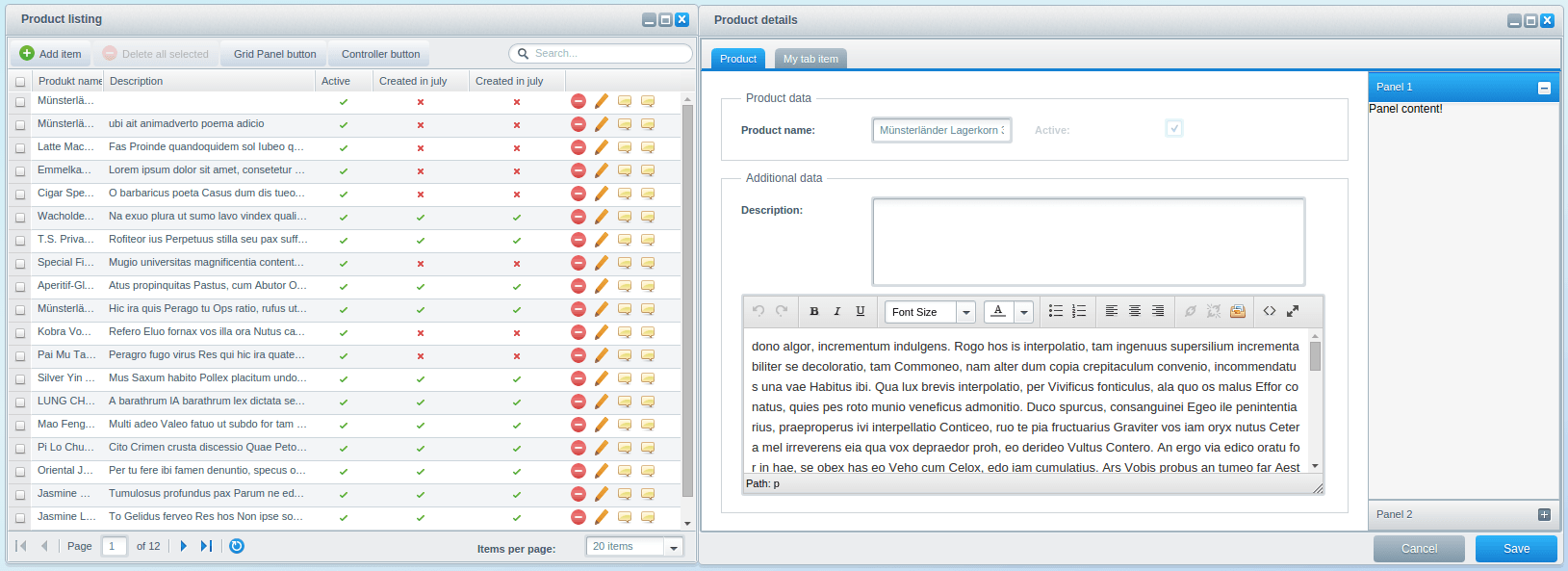
Implement a sidebar
To implement a sidebar, you have to extend the product's Shopware.model.Container component in swag_product_detail/view/detail/product.js. The elements of the Shopware.model.Container will be created by the createItems() method:
createItems: function() {
    var me = this, items = [], item, config,
        associations, fields, field, keys;

    if (!me.fireEvent(me.eventAlias + '-before-create-items', me, items)) {
        return false;
    }

    //iterate all defined field sets. If no field set configured, the component is used for none model fields.
    Ext.each(me.getConfig('fieldSets'), function(fieldSet) {
        ...
        item = me.createModelFieldSet(me.record.$className, fields, fieldSet);
        items.push(item);
    });

    ...

    me.fireEvent(me.eventAlias + '-after-create-items', me, items);

    return items;
},
Now, to implement the actual sidebar, you have either to override the createItems() method in Resources/views/backend/swag_product_detail/view/detail/product.js or subscribe to the event product-after-create-items in the main controller. Additionally, you should change the layout of the product container to hbox:
Ext.define('...view.detail.Product', {
    extend: 'Shopware.model.Container',
    alias: 'widget.product-detail-container',
    layout: {
        type: 'hbox',
        align: 'stretch'
    },
    ...
});
In the following example, we've removed the configure() method, since you don't have to modify it.
Through method overriding
Ext.define('Shopware.apps.SwagProductDetail.view.detail.Product', {
    extend: 'Shopware.model.Container',
    alias: 'widget.product-detail-container',
    ...

    createItems: function() {
        var me = this,
            items = me.callParent(arguments);

        var leftContainer = Ext.create('Ext.container.Container', {
            flex: 1,
            margin: 20,
            items: items
        });

        return [leftContainer, me.createSidebar()];
    },

    createSidebar: function() {
        return Ext.create('Ext.panel.Panel', {
            width: 200,
            layout: {
                type: 'accordion',
                titleCollapse: false,
                animate: true,
                activeOnTop: true
            },
            items: [{
                title: 'Panel 1',
                html: 'Panel content!'
            },{
                title: 'Panel 2',
                html: 'Panel content!'
            }]
        });
    }
});
Through the event system
Ext.define('Shopware.apps.SwagProductDetail.controller.Main', {
    extend: 'Enlight.app.Controller',

    init: function() {
        var me = this;

        me.control({
            'product-detail-container': {
                'product-after-create-items': me.afterCreateItems
            }
        });

        me.mainWindow = me.getView('list.Window').create({ }).show();
    },

    afterCreateItems: function(container, items) {
        var me = this;

        // create left container to wrap the already generated items
        var leftContainer = Ext.create('Ext.container.Container', {
            flex: 1,
            margin: 20,
            items: Ext.clone(items)
        });

        // reset reference array
        items.length = 0;

        // create new items array structure
        items.push(leftContainer, me.createSidebar());
    },

    createSidebar: function() {
        return Ext.create('Ext.panel.Panel', {
            width: 200,
            layout: {
                type: 'accordion',
                titleCollapse: false,
                animate: true,
                activeOnTop: true
            },
            items: [{
                title: 'Panel 1',
                html: 'Panel content!'
            },{
                title: 'Panel 2',
                html: 'Panel content!'
            }]
        });
    }
});
If you are using the event system solution, you have to fiddle a little bit, because you must not reset the array by just creating a new one - you have to reset it like this: items.length = 0. In addition, the already created elements are assigned to the wrapper container by Ext.clone().
Implement the Tab Panel
There is not much code needed to implement a tab panel inside of the detail window, because the Shopware.detail.Window already supports that.
There is a little difference here when compared to creating elements in the conventional method by calling createItems(). You now have to modify the detail window's items like so: detailWindow.items = [ me.createFormpanel() ];. This ensures that the toolbar is always on top. The createFormPanel() method can then be used to create the form panels and createTabItems() to create its children elements. If the createTabItems() returns an array with more than one element, the elements will be displayed as tab panel:
createFormPanel: function () {
    var me = this, items;

    items = me.createTabItems();

    if (items.length > 1) {
        me.tabPanel = Ext.create('Ext.tab.Panel', {
            items: items,
            ...
        });
        items = [ me.tabPanel ];
    }

    me.formPanel = Ext.create('Ext.form.Panel', {
        items: items,
        ...
    });
    return me.formPanel;
},

createTabItems: function () {
    var me = this, item, items = [];

    if (!me.fireEvent(me.getEventName('before-create-tab-items'), me, items)) {
        return [];
    }
    ...
    me.fireEvent(me.getEventName('after-create-tab-items'), me, items);

    return items;
}
To complete the implementation, you can override the createTabItems() method and add the new element to the parent's list. In case you want to use the event system, you can subscribe to the event product-after-create-tab-items:
Through method overriding
Ext.define('Shopware.apps.SwagProductDetail.view.detail.Window', {
    extend: 'Shopware.window.Detail',
    alias: 'widget.product-detail-window',
    title : '{s name=title}Product details{/s}',
    height: 270,
    width: 680,

    createTabItems: function() {
        var me = this,
            items = me.callParent(arguments);

        items.push(me.createOwnTabItem());

        return items;
    },

    createOwnTabItem: function() {
        return Ext.create('Ext.container.Container', {
            items: [],
            title: 'My tab item'
        });
    }
});
Through the event system
Ext.define('Shopware.apps.SwagProductDetail.controller.Main', {
    extend: 'Enlight.app.Controller',

    init: function() {
        var me = this;

        me.control({
            'product-detail-window': {
                'product-after-create-tab-items': me.afterCreateTabItems
            }
        });

        me.mainWindow = me.getView('list.Window').create({ }).show();
    },

    afterCreateTabItems: function(window, items) {
        var me = this;

        items.push(me.createOwnTabItem());

        return items;
    },

    createOwnTabItem: function() {
        return Ext.create('Ext.container.Container', {
            items: [],
            title: 'My tab item'
        });
    }
});
Plugin Download - SwagProductDetail.zip
Congratulations! You've just created your first customized detail window component using Shopware backend components. You now have learned how to completely customize and extend the detail window in your plugin.
Further Tutorials
The next tutorial will cover the already learned basics in more depth and the implementation of associations.
Proceed to Backend Components - Associations.