Responsive Images in Shopware
Introduction
The Shopware default Responsive theme is a fully responsive cross-browser compatible high definition ready theme. This quick tip will introduce you to the "responsive" way of working with images in the Shopware Responsive theme. Working with static widths is a thing of the past. Therefore, the optimal size of the images is often a question. Shopware's solution for this problem is the thumbnail generator in combination with the picture element.
Thumbnail generation
The media manager allows you to upload pictures with large file sizes without having to worry about downsizing them manually. It has a thumbnail generator service that creates thumbnails of your original pictures in sizes you are able to configure beforehand. This ensures a good performance and usability on the different device types. There is also the possibility to create thumbnails that have doubled pixel density, to improve the experience for high dpi display device users. Alternatively you can generate the thumbnails by using the sw:thumbnail:generate Shopware CLI command. Make sure to always upload the biggest possible version of your original image, as the thumbnail generator is only able to downscale from the original images' size.
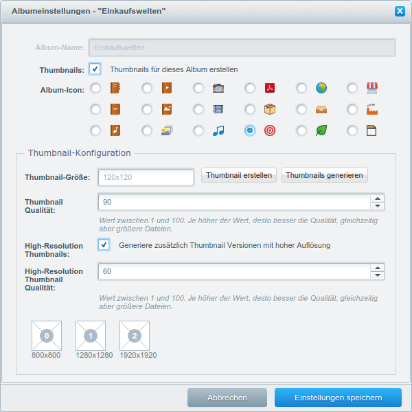
Default product thumbnail sizes:
800px x 800px1280px x 1280px1920px x 1920px
Usage in the frontend
Basic image
This example is the Shopware equivalent to the basic <img src=""> tag. Instead of applying the src attribute, we now have the opportunity to use the srcset, which allows us to specify the original thumbnail and its high dpi optimized version in the same attribute. Depending on the screen density, one of the two pictures is displayed. In convention the high dpi display image names are suffixed with a @2x.
<img srcset="product.jpg, product@2x.jpg 2x" alt="Produktfoto">
Picture element
The picture element takes the term "responsive" even a little step further. It is part of the official W3C standard and is supported by most of the latest browsers. To ensure support for outdated browsers we are using the picturefill.js polyfill.
Inside the picture element we can define multiple image sources and determine their visibility using a media query like syntax in the media attribute. In other words, we can choose which image is displayed at which viewport size or device pixel density. This fits perfectly well with the thumbnails that the thumbnail generator is able to create.
Additionally, the sizes attribute defines how the image is shown in the different viewports. A common unit is vw which stands for viewport with and is the percentual width relative to the viewport.
The picture element also contains a default img tag, in cases the media attributes do not match the browser viewport. The src of the fallback image should be the largest thumbnail available.
<picture>
    <source sizes="(min-width: 48em) 80vw, (min-width: 64em) 50vw, 100vw"
            srcset="product-small@2x.jpg 400w, product-medium@2x.jpg 1200w, product-large@2x.jpg 2560w"
            media="(min-resolution: 192dpi)">

    <source sizes="(min-width: 48em) 80vw, (min-width: 64em) 50vw, 100vw"
            srcset="product-small.jpg 200w, product-medium.jpg 600w, product-large.jpg 1280w">

    <img srcset="product-large.jpg, product-large@2x.jpg 2x" alt="Product picture">
</picture>
To learn more about the srcset and sizes attribute, please refer to the Srcset and sizes blog post by Eric Portis.