Datepicker
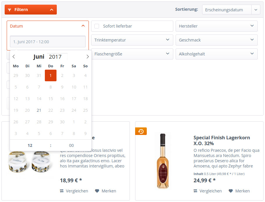
Introduction
The datepicker jQuery plugin was added in Shopware version 5.3 and allows you to easily add a functional datepicker to your themes and plugins, it is based on flatpickr with custom styling added to it.
Basic usage
To add a datepicker to your template, this piece of html will suffice:
<input type="text"
   name="yourName"
   id="yourID"
   placeholder="{s name="datePickerInputPlaceholder" namespace="frontend/index/datepicker"}Select a date...{/s}"
   data-datepicker="true" />
The inputs type is set to "text" because we wouldn't be able to set a placeholder value for an input of type "date". Also, every browser shows slightly different native behaviour for date inputs and this way we're circumventing that. The name and id attributes are important for form submission and you're free to choose any value here. The placeholder attribute lets you define a placeholder string. data-datepicker="true" is what makes the datepicker actually work: via this statement our jQuery plugin is able to identify this input as a datepicker and will then apply various classes to it, as well as generate the necessary markup for the calendar overlay.
Configuration
Template
Like most of our jQuery plugins, the datepicker may be configured through data attributes:
<input type="text"
    name="yourName"
    id="yourID"
    placeholder="{s name="datePickerInputPlaceholder" namespace="frontend/index/datepicker"}Select a date...{/s}"
    data-datepicker="true"
    data-mode="single"
    data-enableTime="true"
    data-enabledDates="2017-05-01, 2017-04-24, 2017-06-15" />
Every data attribute overwrites one of the default values in themes/Frontend/Responsive/frontend/_public/src/js/jQuery.datepicker.js, which alter the behaviour of the datepicker plugin.
| Option | Default value | Possible values | Explanation |
|---|---|---|---|
| mode | 'single' |
single, multiple, range | single: Select a single date multiple: Select multiple dates in one picker range: Select a range of dates in one picker |
| utc | false |
boolean | If true, dates will be parsed, formatted, and displayed in UTC. Pre loading date strings with timezones is recommended but not necessary. |
| wrap | false |
boolean | See https://chmln.github.io/flatpickr/options/ |
| static | false |
boolean | Position the calendar inside the wrapper and next to the input element. |
| weekNumbers | false |
boolean | Enables / Disables week numbers |
| allowInput | false |
boolean | Enables / Disables manual input via keyboard. |
| clickOpens | true |
boolean | Clicking on input opens the date picker. Disable if you wish to open the calendar manually with the open() method. |
| time_24hr | true |
boolean | Enables / Disables time picker 24 hour mode. |
| enableTime | false |
boolean | Enables / Disables the time picker functionality. |
| noCalendar | false |
boolean | Set to true to hide the calendar. Use for a time picker along with enableTime. |
| dateFormat | 'Y-m-d' |
string | More format chars at https://chmln.github.io/flatpickr/formatting/ |
| timeFormat | ' H:i:S' |
string | Is added to dateFormat when enableTime option is set to true. More formats at https://chmln.github.io/flatpickr/formatting/ |
| altInput | true |
boolean | If set to true, the original input is hidden, and a new one displaying a differently formatted time is created. The used format can be specified via the altFormat option. |
| rangeStartInput | null |
string | The name attribute of an additional input field for storing the single start value of a range. Only working with mode 'range'. |
| rangeEndInput | null |
string | The name attribute of an additional input field for storing the single end value of a range. Only working with mode 'range'. |
| altInputClass | 'flatpickr-input form-control input' |
string | If altInput is set to true, the created element will have this class. |
| altFormat | 'F j, Y' |
string | Used when altInput is set to true. More date format chars at https://chmln.github.io/flatpickr/formatting/ |
| altTimeFormat | ' - H:i' |
string | Used when altInput is set to true. More date format chars at https://chmln.github.io/flatpickr/formatting/ |
| multiDateSeparator | null |
char | Defines the symbol which is used to separate multiple dates. Only necessary for mode 'multiple'. The default separator of flatpickr.js is ';'. |
| defaultDate | null |
string / date object | Define the symbol which is used to separate multiple dates. Only necessary for mode 'multiple'. The default separator of flatpickr.js is ';'. |
| minDate | null |
string / date object | The minimum date that a user should be able to pick (inclusive). |
| maxDate | null |
string / date object | The minimum date that a user should be able to pick (inclusive). |
| enabledDates | null |
array | Define an array of dates which should be selectable. You may also pass a comma separated list via data attribute. All unlisted dates will be disabled. |
| parseDate | null |
string | Date parser that transforms a given string to a date object. |
| autoSubmit | false |
boolean | Set to true, to submit the parent form of the date picker input on date change. |
Global
Apart from the element-specific configuration, theres also a global configuration file: themes/Frontend/Bare/frontend/index/datepicker-config.tpl. The values in this file are set via Smarty snippets, so you may easily edit them in the Shopware Backend.
Structure
The datepicker plugin itself is a wrapper around the flatpickr.js dependency. Through this plugin we're able to expose the configuration options listed above and use the Shopware state manager and jQuery plugin base. Those again provide functions to, for example, bind a flatpickr event to some Shopware event, or enabling/disabling the plugin altogether on certain viewports.