Example - Custom detail page
Introduction
In this tutorial you will learn how to create a custom template for detail pages. In this example, we want to replace the default detail page layout and create a more minimalistic layout for marketing purposes. This custom template could be used for products which are not yet in stock, but should be mentioned or announced to the customer.
Preparation
First of all we have to create a new template file in the frontend/detail directory of our theme. In this tutorial we'll name the file custom_detail.tpl:
CustomDetailTheme
 └── frontend
     └── detail
         └── custom_detail.tpl
Then we extend our new template from frontend/detail/index.tpl:
{extends file='frontend/detail/index.tpl'}
We will add some custom LESS/CSS modifications later. Therefore, we add a wrapping div container with an individual class custom-detail:
{block name='frontend_index_content'}
    <div class="custom-detail">
        {$smarty.block.parent}
    </div>
{/block}
Structure
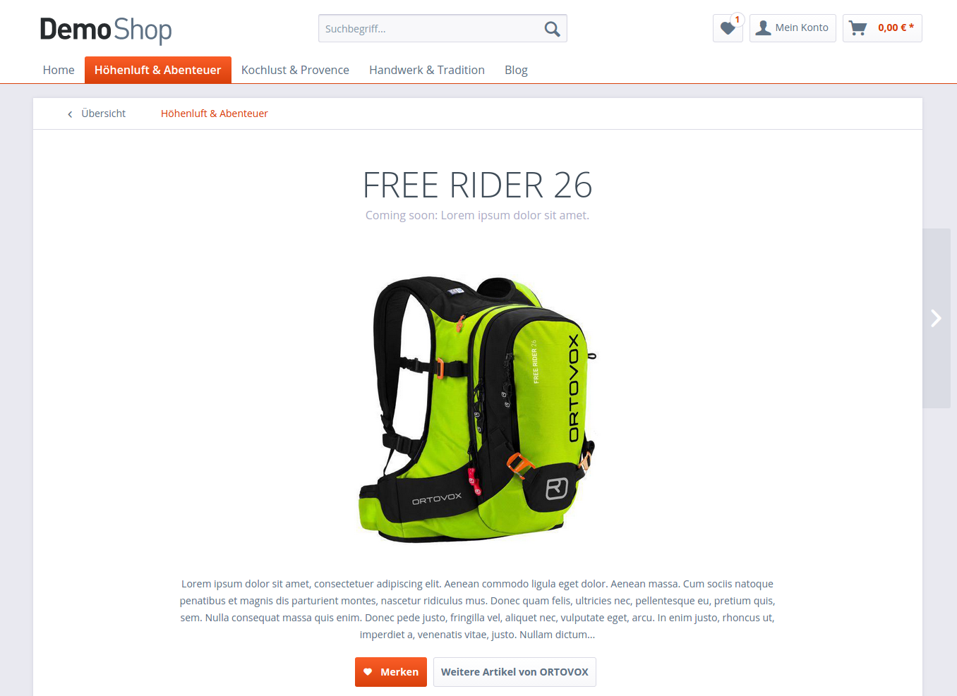
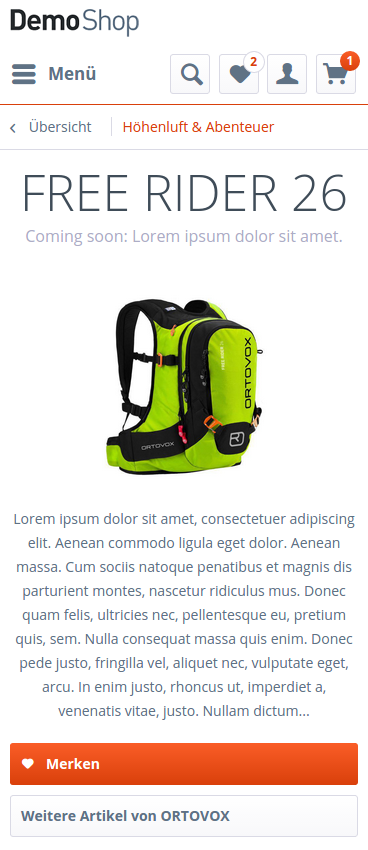
In order to get a more minimalistic design, we want to remove the default product purchase box from the detail page. Don't worry, we will later add the most relevant product information, like the product description, to the template.
This override makes the whole container of the primary buy options disappear:
{block name='frontend_detail_index_buy_container'}
{/block}
Product header
The product header contains the product title as well as the rating stars and the supplier logo. In our example, we only want to show the product title and the short description. To achieve that, we override the product header block. Inside this block, we only want to output $sArticle.articleName and $sArticle.description. The custom-detail--claim container is defined inside a condition and will only be shown when the $sArticle.description exists. We also add individual classes for styling purposes:
{block name='frontend_detail_index_header_inner'}
    <h1 class="custom-detail--title">
        {$sArticle.articleName}
    </h1>

    {if $sArticle.description}
        <div class="custom-detail--claim">
            {$sArticle.description}
        </div>
    {/if}
{/block}
Product description
In the next step, we will replace the default product description and rating tabs by overriding the frontend_detail_index_detail block. Due to our minimalistic design, we want to output the product description with 450 characters at most:
{block name='frontend_detail_index_detail'}
    <div class="custom-detail--description">
        {$sArticle.description_long|truncate:450}
    </div>
{/block}
Product actions
The last thing we need to do in terms of the structure is add the necessary product actions. In our example, we want to show two buttons: a link to other products of the same supplier and a "Remember" button to save the product to the wishlist. The code for these two buttons will also be inside the frontend_detail_index_detail block.
To add the "Remember" button, we create an <a> tag with the btn class, which will apply the general button appearance to it. As we want it to be a large and primary button with an icon on its side, we have to use additional helper classes: is--primary, is--large and is--icon-left. It is also very important to add the link--notepad class. This class is required by the swAjaxWishlist jQuery plugin which adds the current product to the wishlist without a page reload. To make the button work properly, we need to add the following action to the href attribute:
{url controller='note' action='add' ordernumber=$sArticle.ordernumber}
Explanation: We call the add action of the note controller and use the current order number as a parameter.
To keep all ajax functionality, we have to add a data-ajaxUrl data-attribute and do basically the same thing, except that we use the ajaxAdd action:
{url controller='note' action='ajaxAdd' ordernumber=$sArticle.ordernumber}
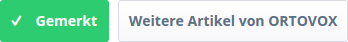
For the button texts we use the existing DetailLinkNotepadShort and DetailLinkNotepad snippets and set the namespace manually to frontend/detail/actions. To make sure that the button text changes to "Remembered" when clicking on it, we wrap the actual button text inside the action--text class. This class is also used by the swAjaxWishlist plugin:
<div class="custom-detail--actions">
    <a class="link--notepad btn is--primary is--large is--icon-left"
       href="{url controller='note' action='add' ordernumber=$sArticle.ordernumber}"
       data-ajaxUrl="{url controller='note' action='ajaxAdd' ordernumber=$sArticle.ordernumber}"
       title="{"{s name='DetailLinkNotepad' namespace="frontend/detail/actions"}{/s}"|escape}">
        <i class="icon--heart"></i>
        <span class="action--text">
            {s name="DetailLinkNotepadShort" namespace="frontend/detail/actions"}{/s}
        </span>
    </a>
</div>
Adding the "More from supplier" button is a little easier. For the value of the href attribute we only need to call the manufacturer action of the listing controller and use $sArticle.supplierID as a parameter:
{url controller='listing' action='manufacturer' sSupplier=$sArticle.supplierID}
The button styling is almost the same and we also use an existing DetailDescriptionLinkInformation snippet for both title attribute and button text:
<a class="btn is--large"
   href="{url controller='listing' action='manufacturer' sSupplier=$sArticle.supplierID}"
   title="{"{s name="DetailDescriptionLinkInformation" namespace="frontend/detail/description"}{/s}"|escape}">
    {s name="DetailDescriptionLinkInformation" namespace="frontend/detail/description"}{/s}
</a>
Using the Shopware default components, you should get the following button appearance:

Smarty code overview custom_detail.tpl
{extends file='parent:frontend/detail/index.tpl'}

{block name='frontend_index_content'}
    <div class="custom-detail">
        {$smarty.block.parent}
    </div>
{/block}

{block name='frontend_detail_index_buy_container'}
{/block}

{block name='frontend_detail_index_header_inner'}
    <h1 class="custom-detail--title">
        {$sArticle.articleName}
    </h1>

    {if $sArticle.description}
        <div class="custom-detail--claim">
            {$sArticle.description}
        </div>
    {/if}
{/block}

{block name="frontend_detail_index_detail"}
    <div class="custom-detail--description">
        {$sArticle.description_long|truncate:450}
    </div>

    <div class="custom-detail--actions">
        <a class="link--notepad btn is--primary is--large is--icon-left"
           href="{url controller='note' action='add' ordernumber=$sArticle.ordernumber}"
           data-ajaxUrl="{url controller='note' action='ajaxAdd' ordernumber=$sArticle.ordernumber}"
           title="{"{s name='DetailLinkNotepad' namespace="frontend/detail/actions"}{/s}"|escape}">
            <i class="icon--heart"></i>
            <span class="action--text">
                {s name="DetailLinkNotepadShort" namespace="frontend/detail/actions"}{/s}
            </span>
        </a>
        <a class="btn is--large"
           href="{url controller='listing' action='manufacturer' sSupplier=$sArticle.supplierID}"
           title="{"{s name="DetailDescriptionLinkInformation" namespace="frontend/detail/description"}{/s}"|escape}">
            {s name="DetailDescriptionLinkInformation" namespace="frontend/detail/description"}{/s}
        </a>
    </div>
{/block}
Styling
Because of the changes we made to the structure, we need to adjust the styling. To keep things organized, we will create a new file named custom-detail.less:
CustomDetailTheme
 └── frontend
     └── _public
         └── src
             └── less
                 ├── all.less
                 └── custom-detail.less
Don't forget to import the file inside the all.less:
@import "custom-detail";
To ensure that our styling adjustments are only applied on the custom detail page, we wrap our code inside the class we have created before:
.custom-detail {
    // Custom styling here
}
First of all, we want to center the product title, description and action buttons:
.product--header,
.custom-detail--description,
.custom-detail--actions {
    text-align: center;
}
Styling the product header
To get a modern and minimalistic design, we increase the font-size of the product title to 50px and set the font-weight to 300. The product's short description inside the custom-detail--claim gets a smaller font-size and a gray color:

.custom-detail--title {
    .unitize(font-size, 50);
    .unitize(line-height, 45);
    .unitize-margin(10, 0, 10, 0);
    font-weight: 300;
}

.custom-detail--claim {
    .unitize(font-size, 16);
    .unitize(margin-bottom, 30);
    color: darken(@gray-dark, 15%);
}
Styling the product image
Due to the fact that we have removed the default purchase box, we can center the product image in the middle of the main content area. To achieve that, we give the the default product--image-container a width: 100% and remove the floating with float: none;:
.product--image-container {
    float: none;
    width: 100%;
}
When the product has more than one image, the product slider with slider dots and thumbnails will show up on the detail page. The slider dots are positioned absolute by default. We don't want the slider dots to be absolute and we give them a position: relative so they are displayed as a normal block element right underneath the product image:
.image-slider--dots {
    .unitize-padding(15, 0);
    position: relative;
    top: auto;
}
We also don't want the thumbnails of the image slider to be shown on the page:
.image-slider--thumbnails {
    display: none;
}
The image slider container has a bottom margin for those thumbnails by default. Because we have removed it, we can also remove the bottom margin:
.image-slider--container {
    margin-bottom: 0;
}
Styling the product description
On tablet landscape and desktop viewports, we want the product description to be centered and with 75% width:
@media screen and (min-width: @tabletLandscapeViewportWidth) {
    .custom-detail {
        .custom-detail--description {
            margin: 0 auto;
            width: 75%;
        }
    }
}
Styling the product actions
To add a bit more spacing between the product action buttons and the further page content, we apply some margin and padding as well as a horizontal line:
.custom-detail--actions {
   .unitize(padding-bottom, 30);
   .unitize(margin-bottom, 30);
   border-bottom: 1px solid @border-color;
}
We also want the buttons to be block elements on the phone viewport:
.btn {
    .unitize(margin-bottom, 10);
    display: block;
}
As mentioned before, the text of the "Remember" button should change to "Remembered" when you add an item to the wishlist. We want to give this behavior a nice touch and change the background to a success color:
.link--notepad.js--is-saved {
    color: #fff;
    background: @highlight-success;
}
Now we can set the buttons back to inline-block when the phone landscape viewport is reached:
@media screen and (min-width: @phoneLandscapeViewportWidth) {
    .custom-detail {
        .custom-detail--actions {
            .btn {
                .unitize(margin-right, 5);
                display: inline-block;
            }
        }
    }
}
LESS code overview custom-detail.less
.custom-detail {
    .product--header,
    .custom-detail--description,
    .custom-detail--actions {
        text-align: center;
    }

    .custom-detail--title {
        .unitize(font-size, 50);
        .unitize(line-height, 45);
        .unitize-margin(10, 0, 10, 0);
        font-weight: 300;
    }

    .custom-detail--claim {
        .unitize(font-size, 16);
        .unitize(margin-bottom, 30);
        color: darken(@gray-dark, 15%);
    }

    .product--image-container {
        float: none;
        width: 100%;
    }

    .image-slider--dots {
        .unitize-padding(15, 0);
        position: relative;
        top: auto;
    }

    .image-slider--thumbnails {
        display: none;
    }

    .image-slider--container {
        margin-bottom: 0;
    }

    .custom-detail--actions {
        .unitize(padding-bottom, 30);
        .unitize(margin-bottom, 30);
        border-bottom: 1px solid @border-color;

        .btn {
            .unitize(margin-bottom, 10);
            display: block;
        }

        .link--notepad.js--is-saved {
            color: #fff;
            background: @highlight-success;
        }
    }
}

@media screen and (min-width: @phoneLandscapeViewportWidth) {
    .custom-detail {
        .custom-detail--actions {
            .btn {
                .unitize(margin-right, 5);
                display: inline-block;
            }
        }
    }
}

@media screen and (min-width: @tabletLandscapeViewportWidth) {
    .custom-detail {
        .custom-detail--description {
            margin: 0 auto;
            width: 75%;
        }
    }
}
JavaScript
Because of the new layout, we don't have enough space to show the mouseover image zoom which is displayed on the desktop viewport. We will remove the specific jQuery plugin on our custom detail page.
To add JavaScript functionality, we create a new file named jquery.custom-detail.js:
CustomDetailTheme
 └── frontend
     └── _public
         └── src
             └── js
                 └── jquery.custom-detail.js
We also need to include the new file inside the Theme.php of our custom theme:
protected $javascript = array(
    'src/js/jquery.custom-detail.js'
);
The code to remove the image zoom is pretty simple. We check if the main content-wrapper has a child div with the custom-detail class. If this is the case, we can remove the plugin for the xl viewport using the removePlugin method of the StateManager.
(function($, window) {
    if($('.content--wrapper').children('div').hasClass('custom-detail')) {
        window.StateManager.removePlugin('.product--image-zoom', 'swImageZoom', 'xl');
    }
}(jQuery, window));
Download theme plugin
If you want to take a closer look at all the code we have written in this tutorial you can download this plugin:
The theme is packed inside a plugin. This is a requirement to distribute themes via our store. The structure of the theme is exactly the same as before, it is just placed a few layers deeper in the directory hierarchy:
SwagCustomDetailTheme
└── Resources
    └── Themes
        └── Frontend
            └── *The theme folder*
In addition, the root directory of the plugin contains a plugin base file and a plugin.xml with meta information.
For more information on the Shopware plugin system, please head over to our developer documentation.