When making changes to the Shopware 5 Responsive theme, all different viewport sizes have to be considered and adjusted in order to be correctly displayed on every device the user is visiting the shop with. This is a new step in the Shopware theme development and fundamentally different than in Shopware 4 templates, where static widths and fixed containers were the main thing a developer had to worry about. Device testing is the best option to ensure the changes made to the frontend are working across all devices. Large agencies often have special testing equipment for the developers (which is always preferred) but, especially for small projects or private developers, the budget often makes this impossible. The Chrome DevTools are a great solution for that and allow developers to emulate many features of mobile devices inside the browser with just a few clicks. This article is a small introduction on how to use the DevTools to improve your responsive design adjustments and test them with the emulation features that the developer tools offer.
Note: Even though the emulation services are great features that help you with testing your application, it is not a full replacement for testing on real mobile devices and you should always be aware of its limitations.
As an example, lets take the image slider of the Shopware 5 Responsive theme and take a closer look at a few of the different basic emulation features of the Chrome DevTools that could be used to test and inspect the elements. This testing can be roughly categorized in three different sections:
- device emulation - does the slider have the intended responsive behavior?
- touch event emulation - does the slider support mobile touch events?
- network throttling - how does the slider behave under varying network conditions?
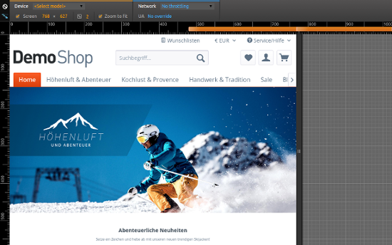
In terms of responsive design, one of the most important features that the Chrome DevTools offer is the device emulation service. It allows you to view your web service in specific device metrics (e.g. the Apple iPhone 6 viewport size) or in a custom size, either by resizing the preview or defining a new custom device in the "Settings" window. Adding custom devices is actually a very nice addition and comes in handy when testing for a specific device size that is not already defined in the presets. The feature also contains device pixel ratio emulation, which is the ratio between logical pixels and physical pixels, and allows the simulation of browsing on a high dpi display device like the Apple iPhone 6. The emulation lets you quickly switch between the different device sizes to ensure the shop is correctly displayed in all different viewports.
In the inspection window you even have the ability to display all media queries defined in your stylesheets and directly switch the viewport metrics to that specific size. In the Responsive theme, due to the mobile-first principle, the default media queries would be the mobile viewport, min-width 30em, min-width 48em and min-width 64em.
Note: Color codes of media query preview:
Queries targeting a maximum width.
Queries targeting widths within a range.
Queries targeting a minimum width.
When testing the slider, you can focus on the defined CSS breakpoints and inspect the element based on the different viewport sizes. If settings need to be adjusted or the element does not work as intended, you can directly see in what breakpoint definition the changes need to happen.

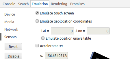
Touch events are a large part of mobile device usability and can be found in many places of the Shopware 5 Responsive theme. Touch gestures should always be considered when making adjustments that could benefit from using them, but have to be particularly tested due to possible differences between operating systems and devices. The DevTools allow you to emulate the basic touch events inside the browser by simulating the touch gestures from your mouse input. You can enable the emulation feature in the "Emulation" panel under the point "sensors". The Shopware 5 image slider is optimized for touch events on mobile devices and uses swipe gestures (among others) to navigate through the slides. This can be easily tested with the touch gesture emulation.

The network throttling feature of the Chrome DevTools is able to emulate a slower internet connection based on different predefined network speed levels (e.g. using a decent 2G connection on a smartphone). It can be enabled in the "Network" tab of the DevTools. The throttling gives you a feeling of how a user with a slower internet connection views your shop and how you may improve his browsing experience. This is a very important part every developer should keep in mind, especially with the always increasing mobile device traffic of the internet. Shopware in general has great features like the thumbnail generation and the asset minification/concatenation that reduces the serving time of the shop and ensures a good performance for every user, no matter what device/connection they are browsing with. When inspecting the slider, image sizes can often be problematic, but the image minification feature that Shopware brings solves that problem. Keeping an eye on the resource file sizes in the "Network" tab of the DevTools can be very helpful when a performance problem occurs.

Conclusion
The DevTools offer very useful features when testing the adjustments in the development process. The emulation services reach way beyond the device, touch event and network emulation, especially in the performance & profiling section, but these are very comprehensive and can be talked about in an own article. The emulation features allow the developers to quickly perform tests and adjust the code according to the results. Working with the DevTools while developing may help and optimize the workflow, but it will never replace the testing on actual devices that has to be done before the integration of adjustments.

